Project Overview
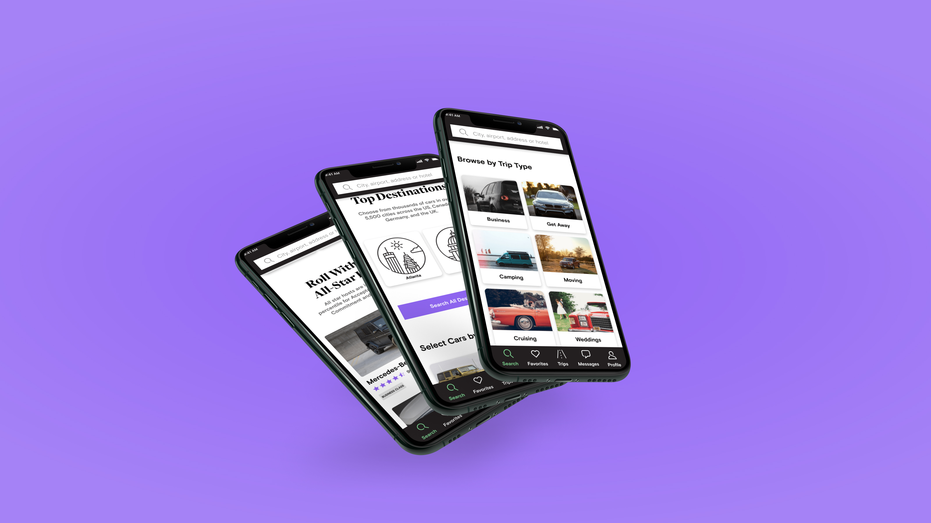
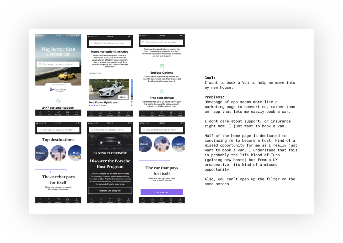
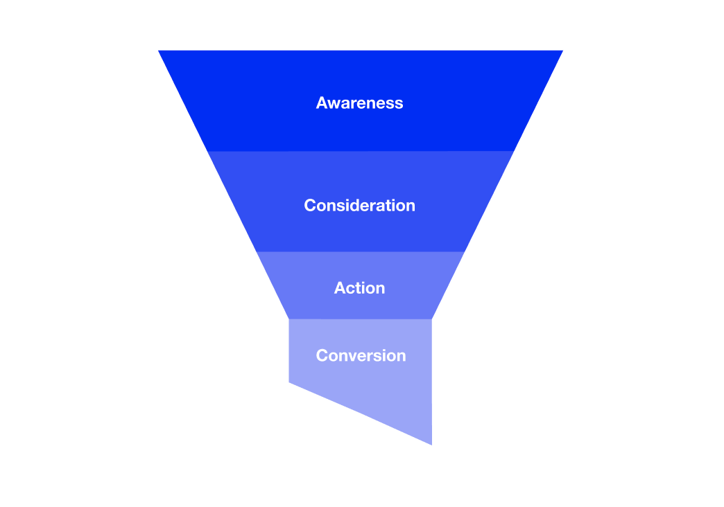
I will address how Turo can create a pleasant booking experience for these individuals within the consideration phase of the sales funnel. The overall goal of which is to increase understanding of what vehicles Turo currently offers on its platform, and allow users to quickly evaluate what vehicle is best for them while on the home screen.
Turo helps its users ride with style by offering more than just a rental car, but a holistic rental experience. Turo spans many use cases for individuals who do not own a car and users who need one while away on holiday. But what about users who need a different car than the one they currently own?
Year
Platform
Role
Project Files
Research

Designing for those who Consider
Design
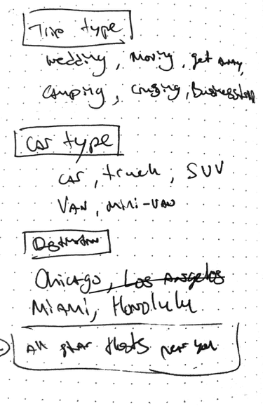
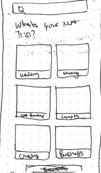
.png)
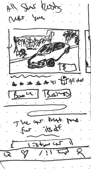
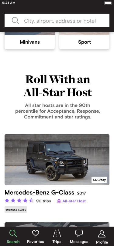
The Results Are in
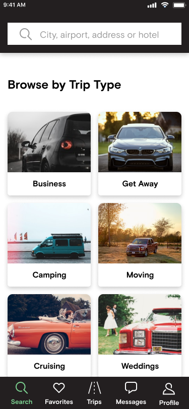
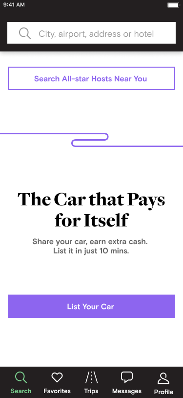
After designing my initial concept, I tested it to see if I had indeed designed an experience that helped users find a vehicle to help them move. I did this by pitting the current Turo home screen against my newly designed home screen.
Participants
Two Tests
Preferred my design
“I love how it shows all categories up front and makes it easy for me to make my choices.”
“This option, to me, looks way more professional. The other one seemed cluttered and too full of ads.”

