JPS

Project Overview
Research
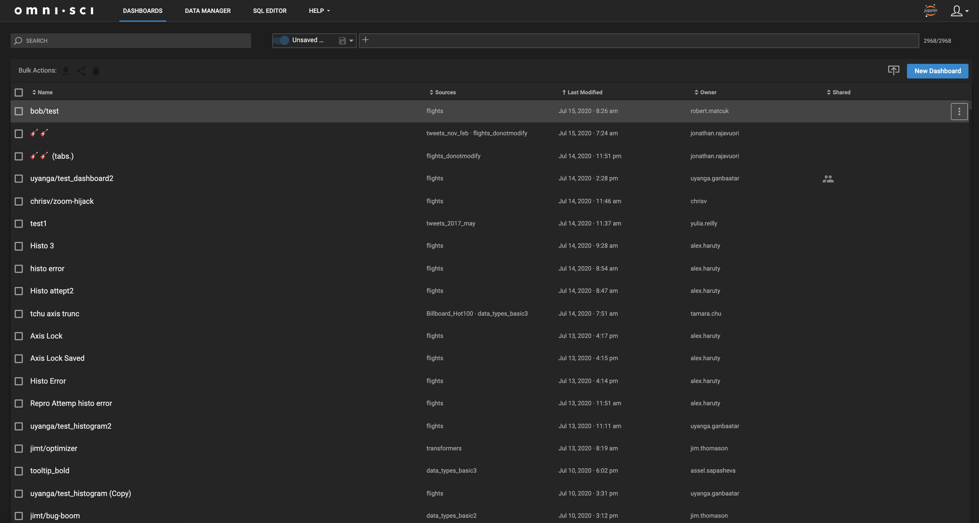
These products shared a similar problem, in that their users’ could generate hundreds to thousands of rows of data, and would need a way to quickly view, edit, and save views for future use.
From my research, I took away the following to act as guiding principles for my initial concept.



After loads of research and diving into these interfaces, I was still struggling with how to “place” the different action interfaces, and bring a seamless experience to the current UI of OmniSci's dashboard manager.
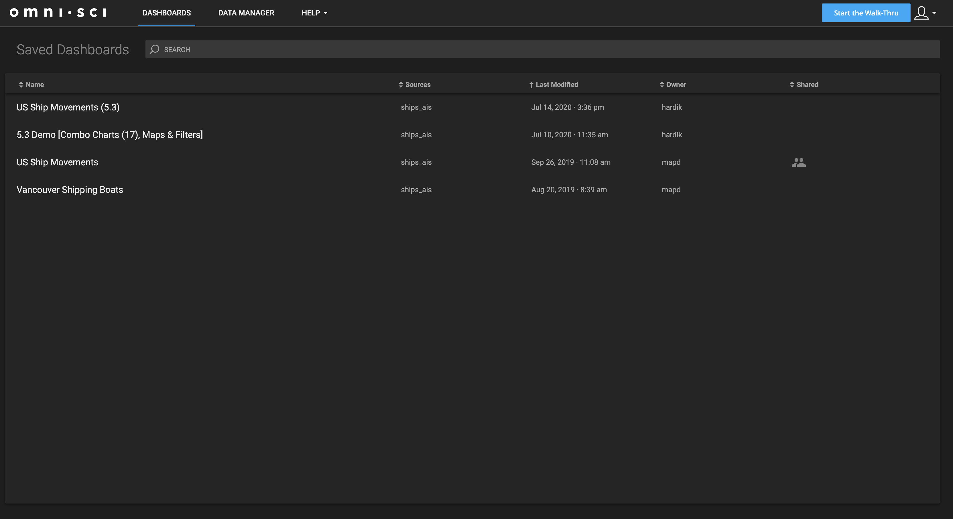
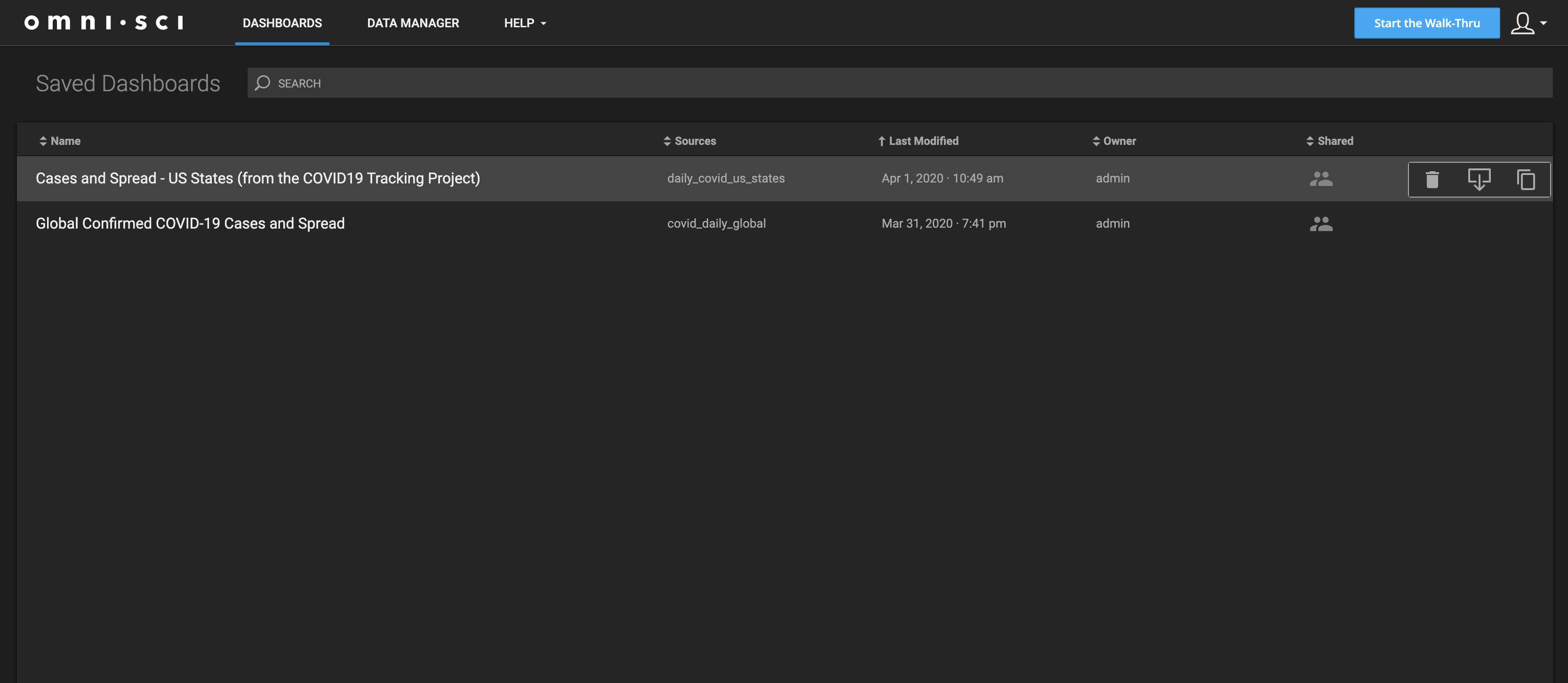
The problem with the current UI, was that the Navigation and create new dashboard were in conflict from a hierarchy POV. The import and “add new Dashboard” Controls were nested next to the search bar, an organism that altered the view of the list below but did not add to it.
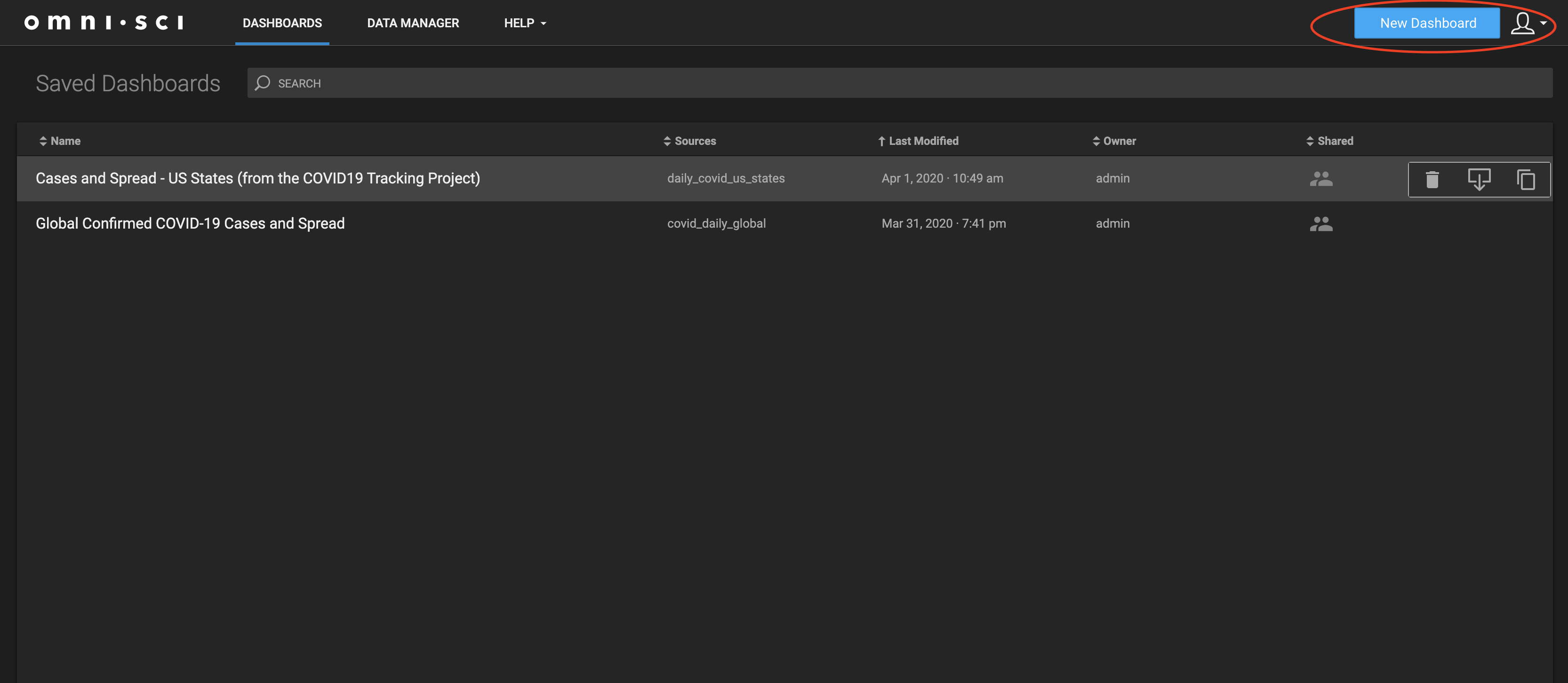
My solution to this problem was to bring visual clarity to these elements by placing them in their own separate locations. You can see from the image above, my plan was to nest these elements in a parent Child sibling manner. Navigation being the highest level, adding a new dashboard through importing or starting from scratch, and then the list view, with the search, filter, bulk actions, and saved view UI. I believe this to be a more helpful option for users and the law of common region can back me up on that.

Sketching
Before jumping into Figma land, I spent a couple of hours sketching out the different organisms of my UI. This would help me save time when I jumped into Figma.
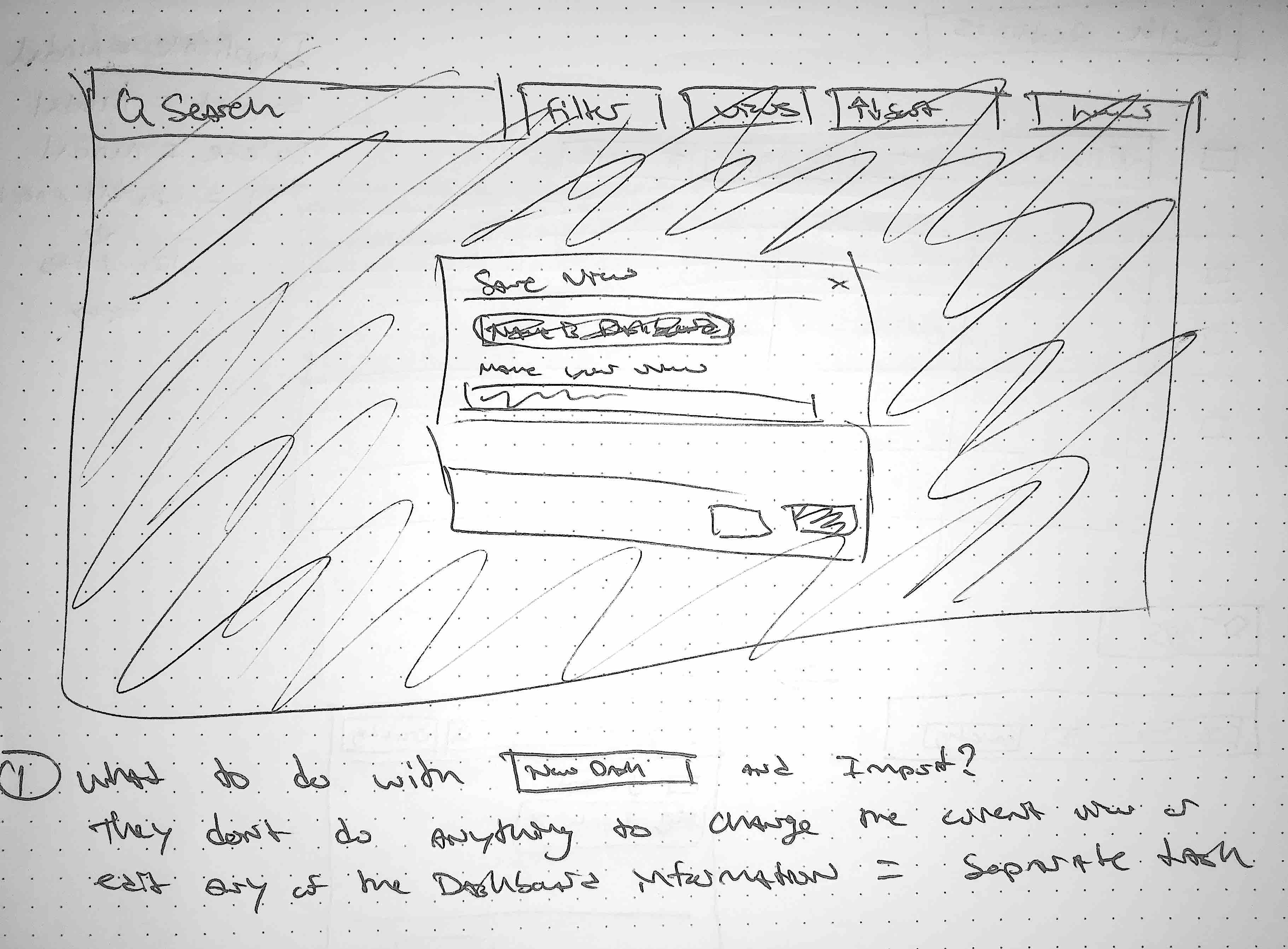
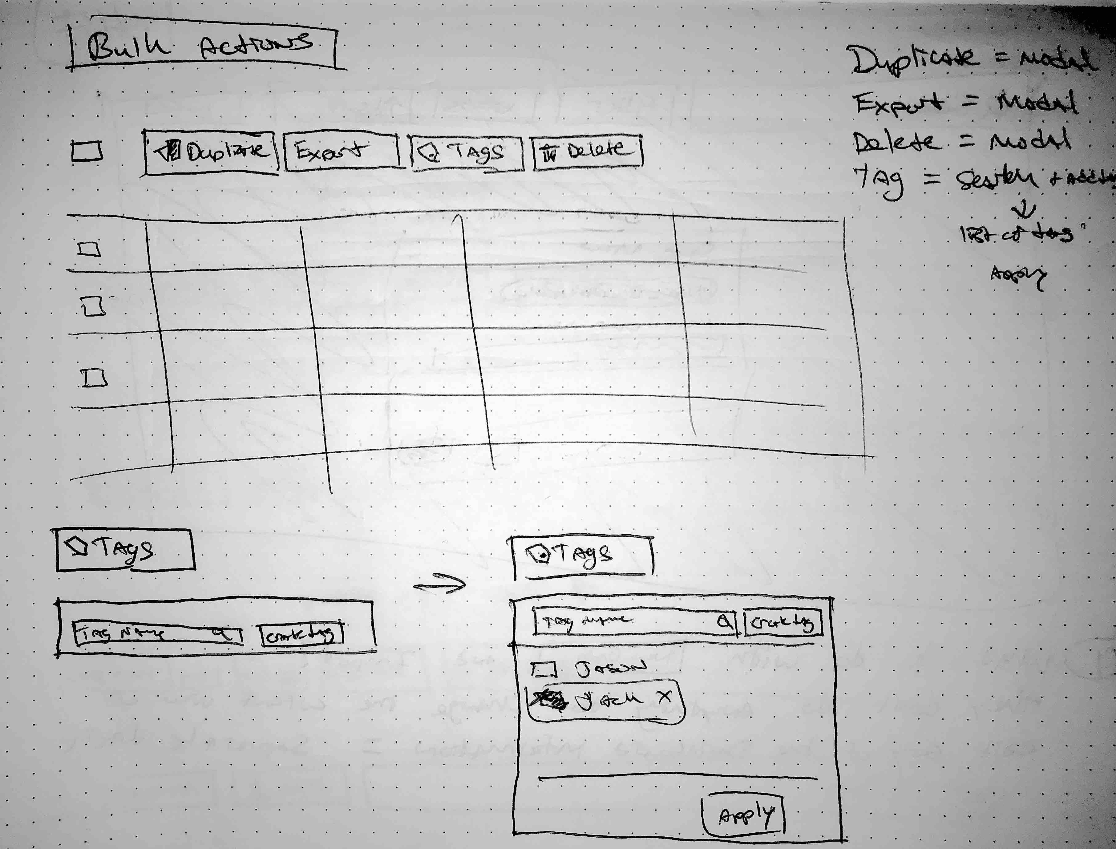
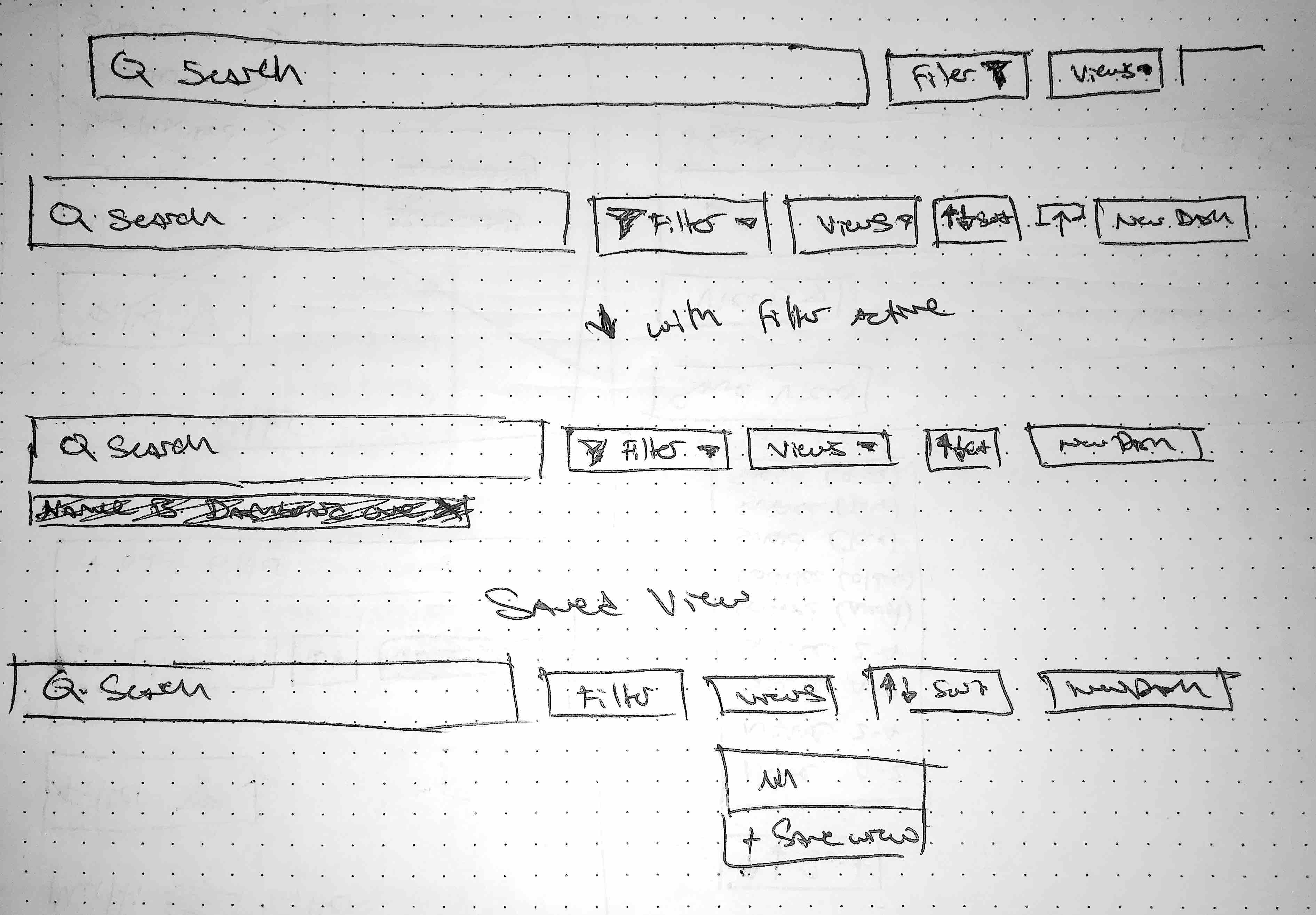
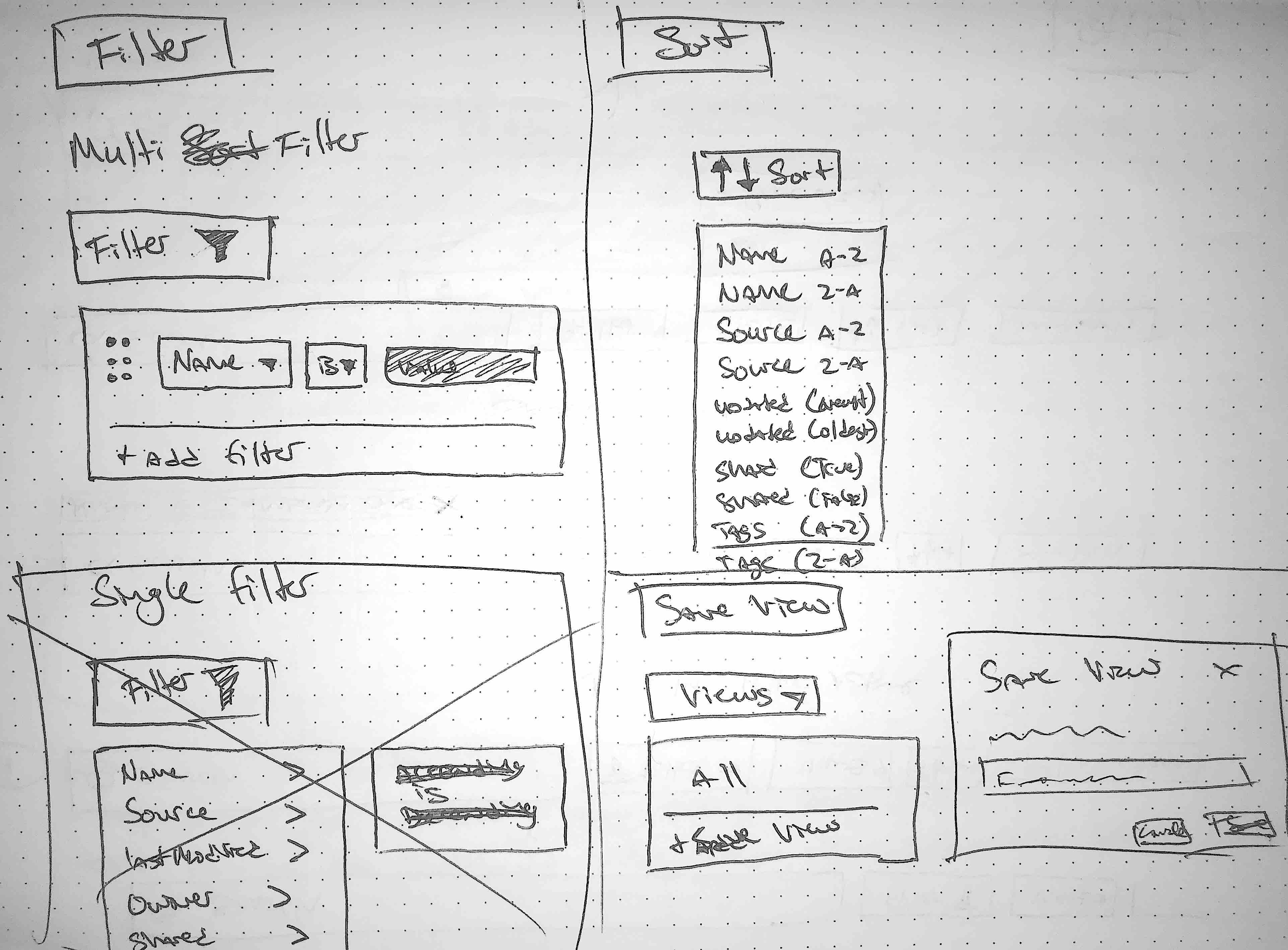

Flow Mapping the Experience
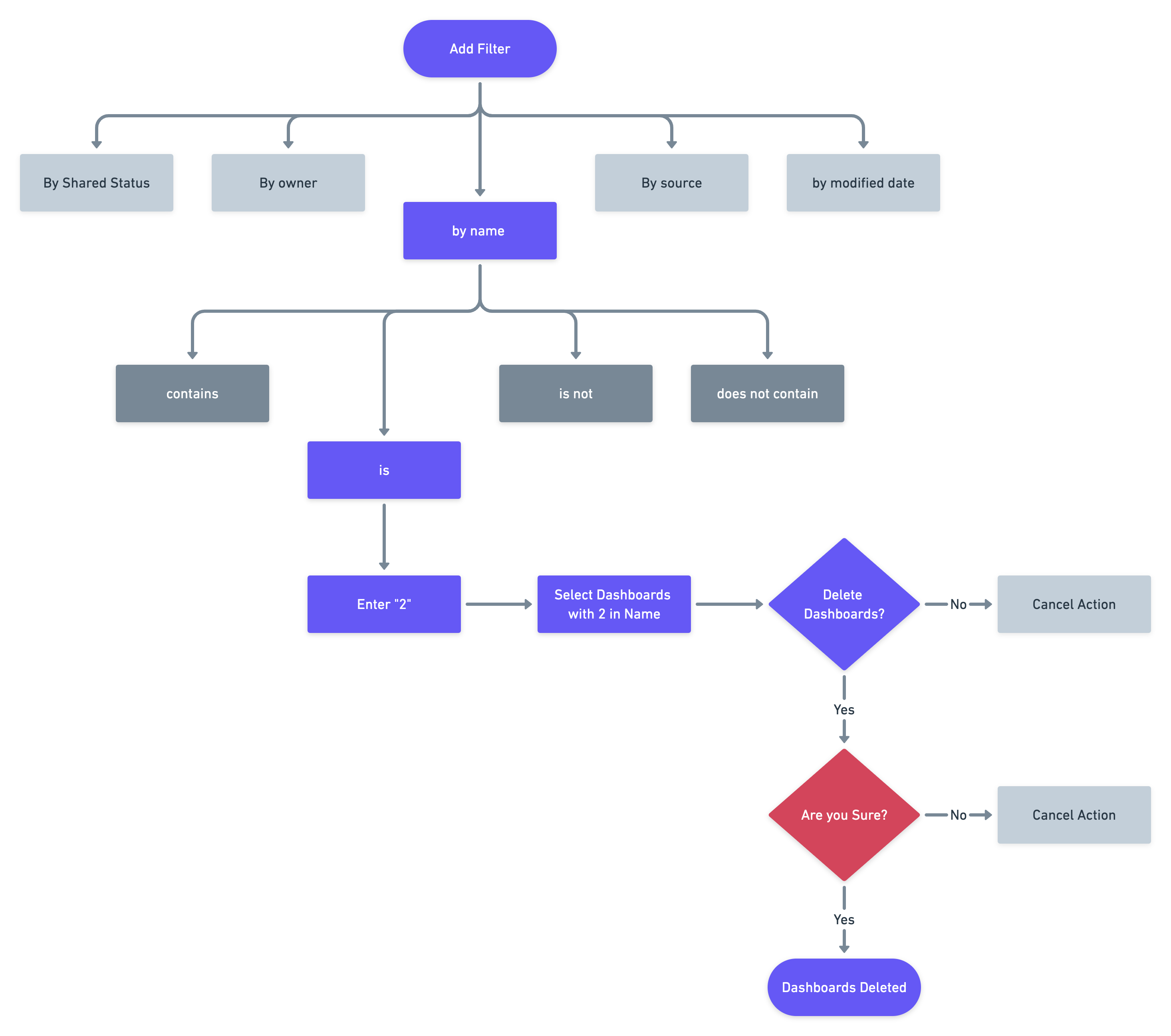
To make way for a less messy Figma experience later on, I entrusted myself to a few handy dandy user flows. This helped me further solidify the interaction and plan out the number of steps/screens I would need to design for in my primary actions:
Find, via the filter button, dashboards that contain the number 2 and delete any copies found.
Mockups and Iterations
After spending some late nights on this bad boy, I was happy to make it out the other side with a workable mock-up to share with the team.

Feedback
- Sorting wouldn’t be necessary as we can just use column headers for that.
- Search Bar takes up too much space, lets try to combine and reduce its size a bit?
- Too much white space, (designers nightmare??) wasted space with the import add dashboard button. Probably combine the two.
This feedback pushed me toward breaking down my design as well as combining and refining the design based off of the feedback I received.

Iterations and Convergence
Our meetings validated our designs, with one customer stating: "If this was shipped today, it would solve 90% of my problems."
Though this might not be a monster of a problem, it did however require a lot of discipline on my part to not to try and reinvent the wheel. Sometimes solving user problems is a lot more cut and dry than we make it.
