JPS
Project Overview
Their goals were simple, create a unique e-commerce store that could process payments simply and easily, communicate their value through imagery and copy, and create a wonderful shopping experience that spoke to customers at every stage of the buyer’s journey.
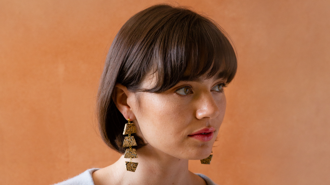
Dear Survivor is a bespoke sustainable high-fashion accessory company based out of San Diego, currently owned and operated by my good friend Christine and her husband Cody. They needed help for a big rebrand and wanted to relaunch their website.
Good Design,
Starts with People
Dear Survivor has been designing sustainable products since 2015. Not only do they create beautifully timeless pieces, but they do so in a manor that is both waste and carbon neutral. My job was to make sure their design aesthetic was reflected through their website, and that their website enabled visitors to purchase quickly and easily. Working with the brand team at Parker and Co, we were able to ensure Dear Survivor's brand quality was maintained through all customer touch points.
Below you will find a basic overview reviewing some of the deliverables and design strategies is used to design and build Dear Survivor's website. For a full synopsis of my work, please download the full case study below: view case study
Below you will find a basic overview reviewing some of the deliverables and design strategies is used to design and build Dear Survivor's website. For a full synopsis of my work, please download the full case study below: view case study
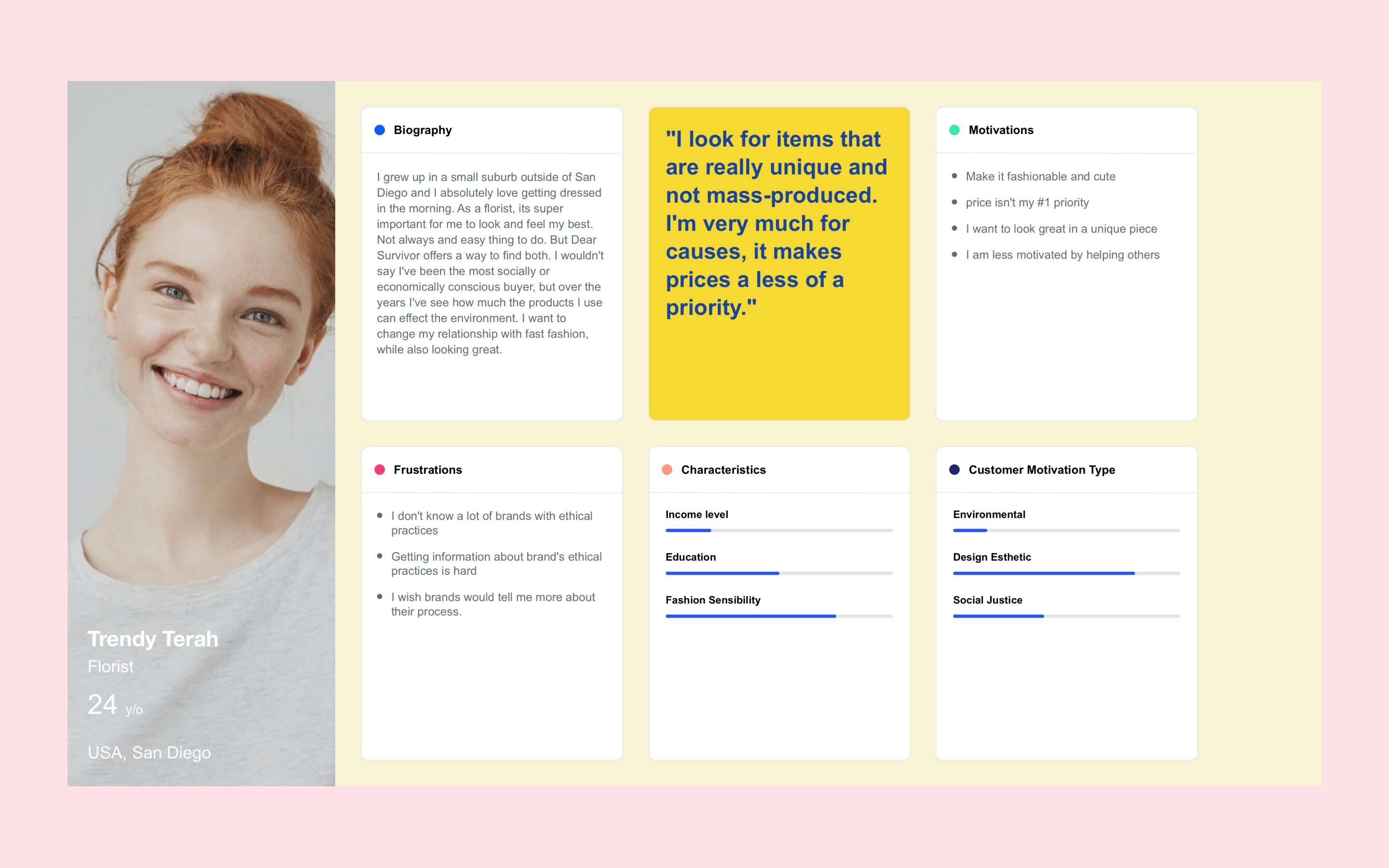
User Research and Personas
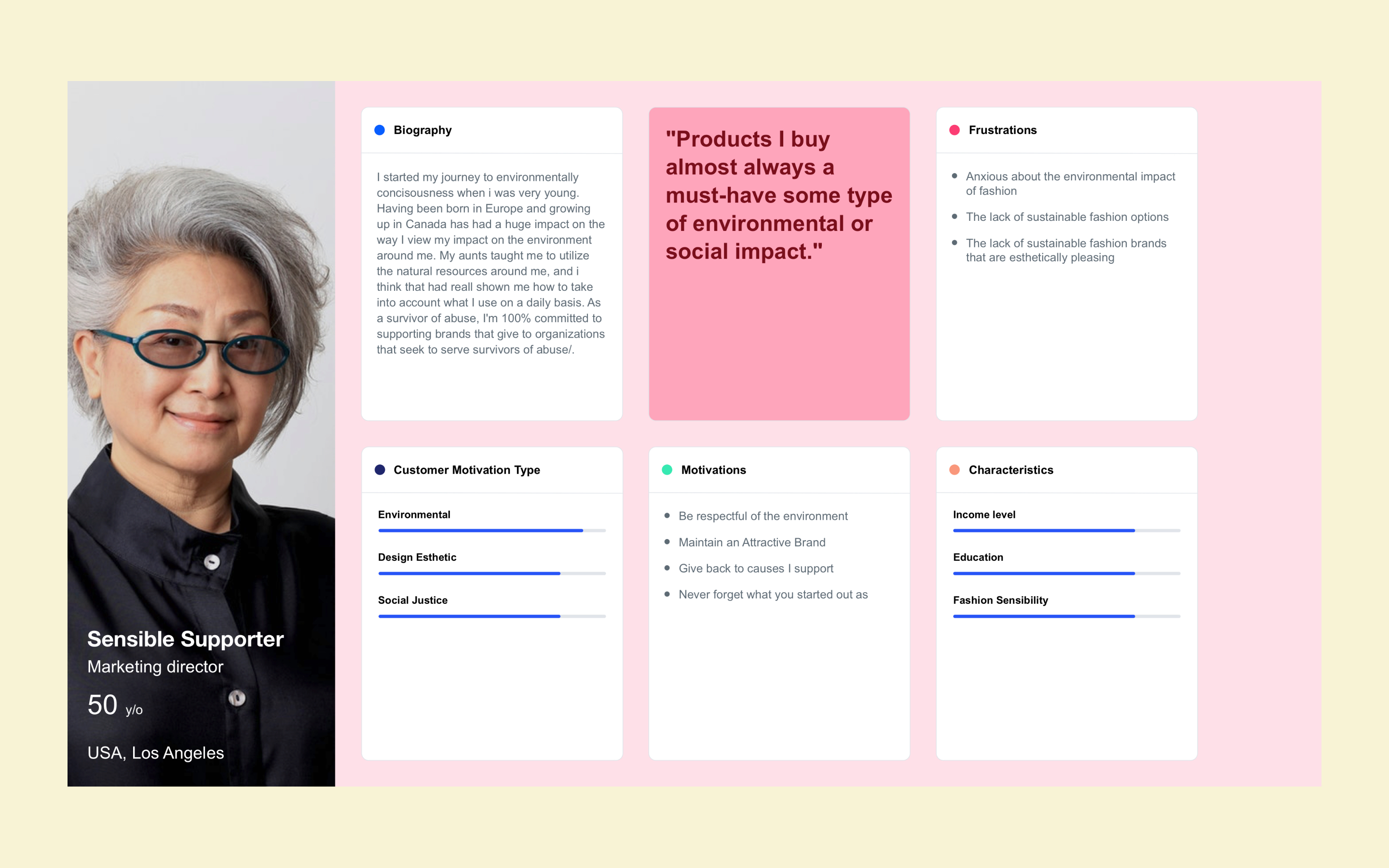
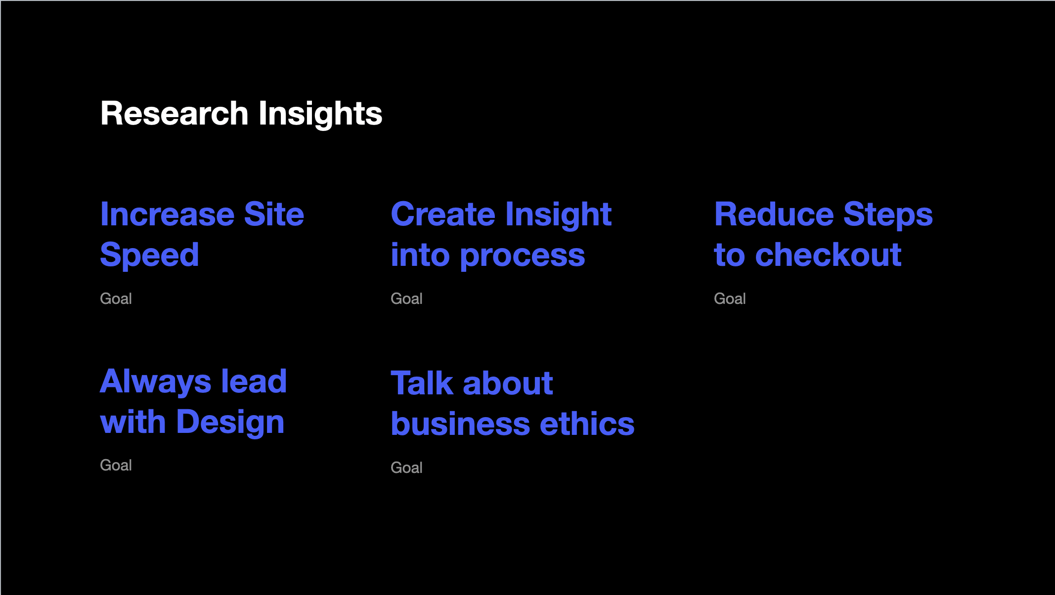
Research Insights
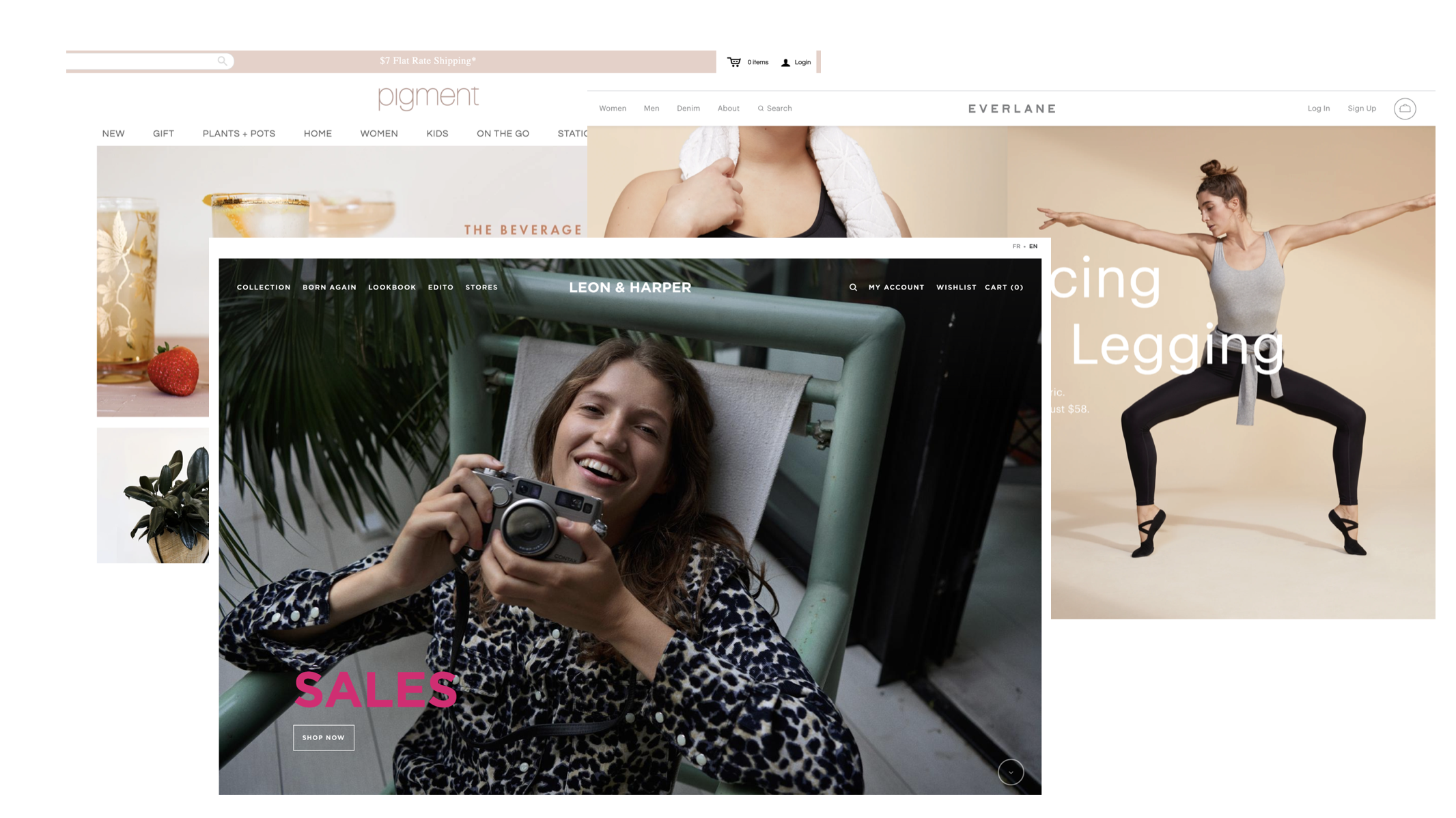
Comparative analysis
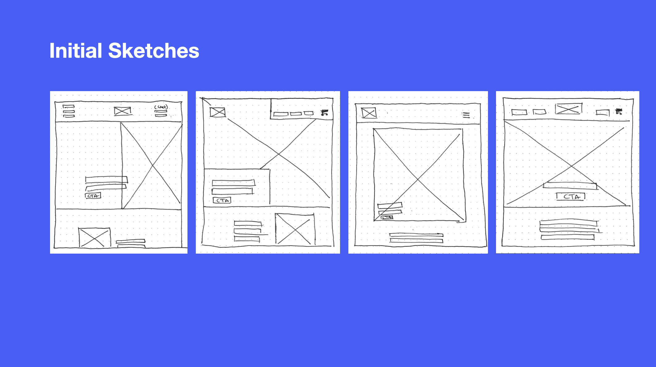
Initial Sketches
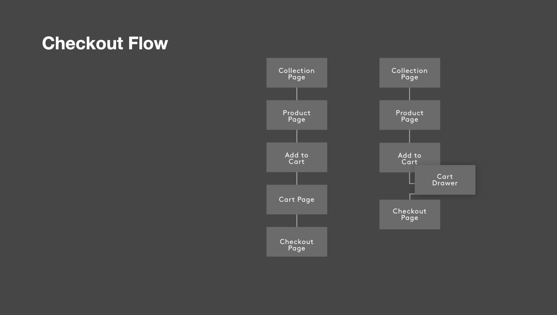
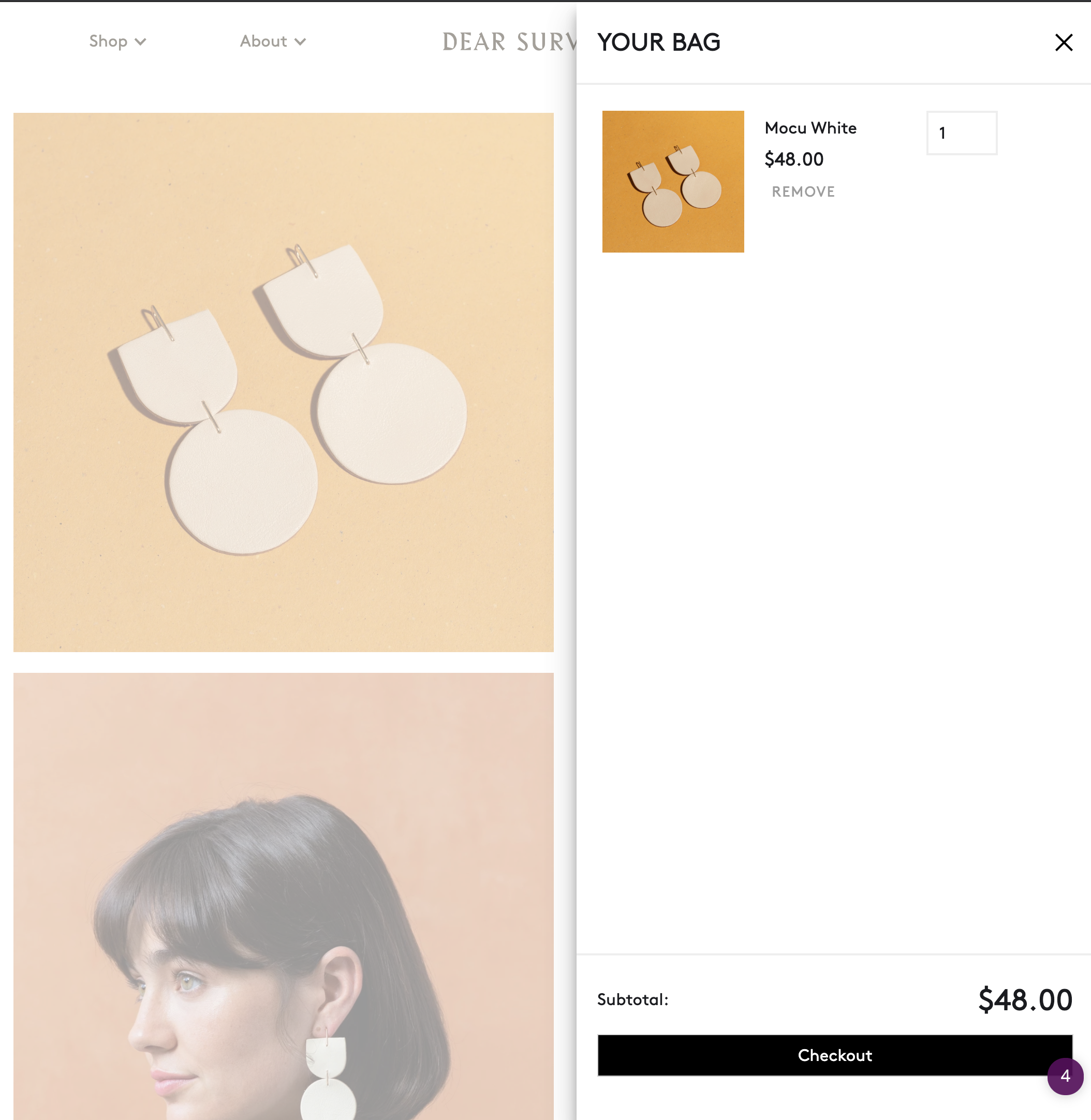
Checkout flow
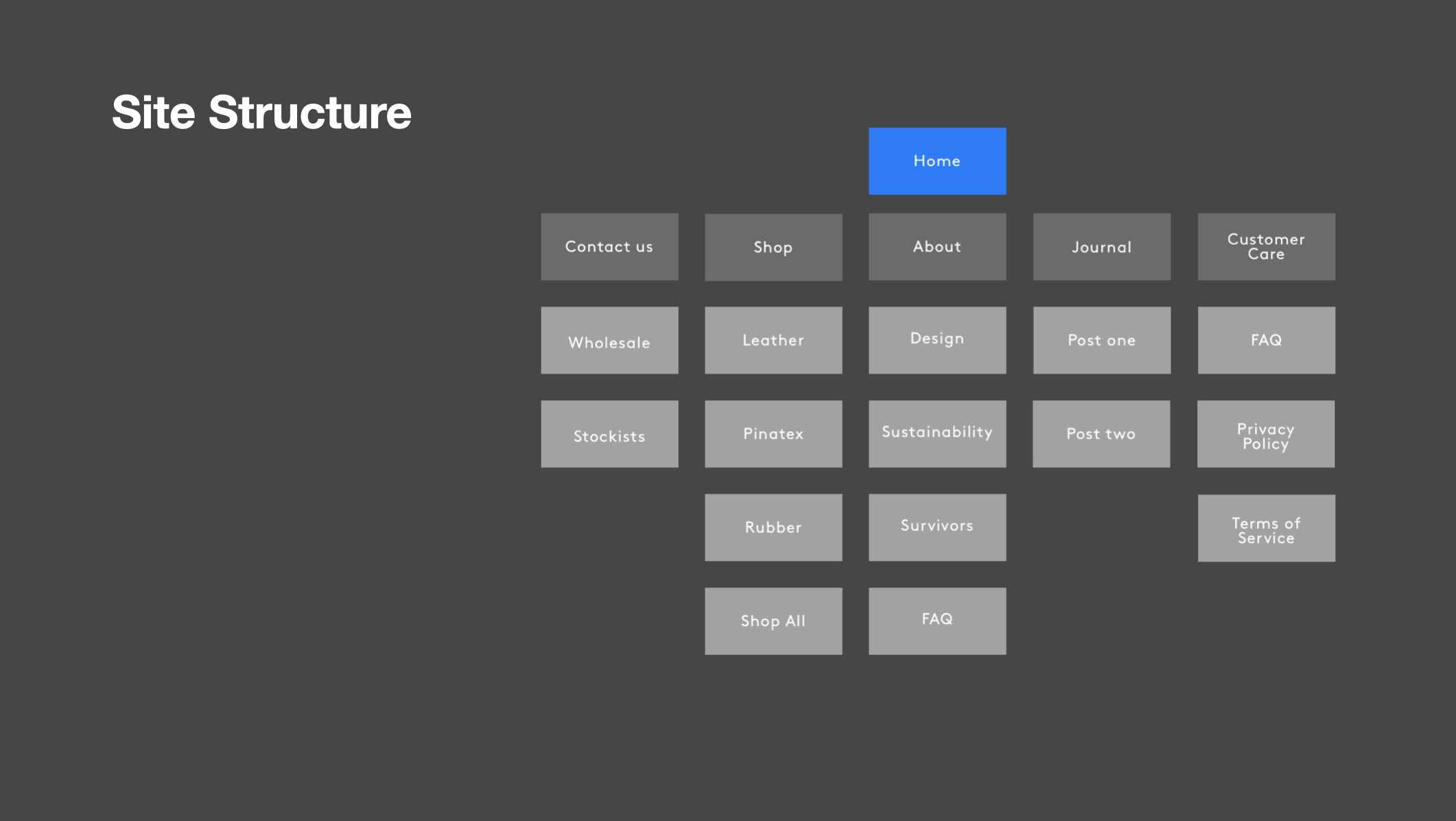
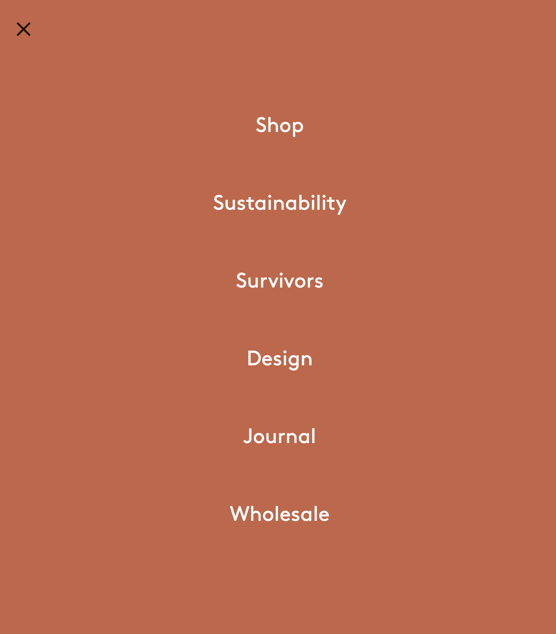
Site Map
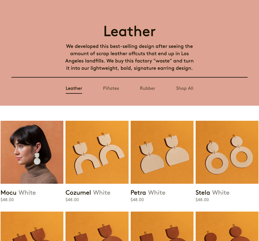
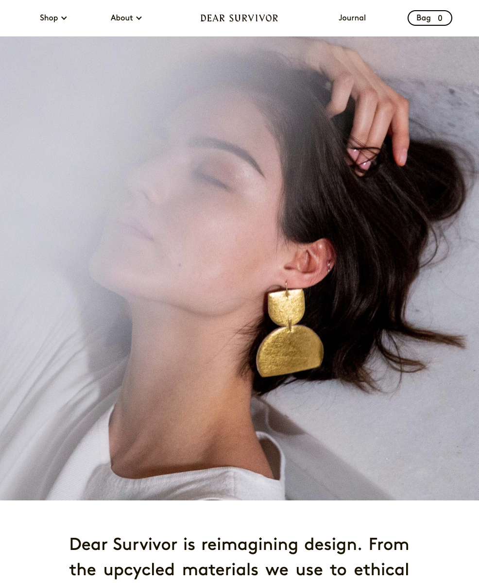
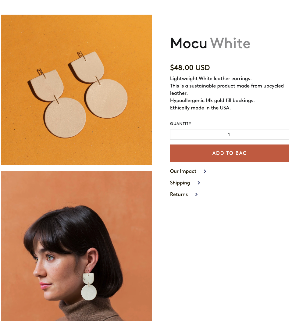
Final Design
308% Increase
in Conversion Rate
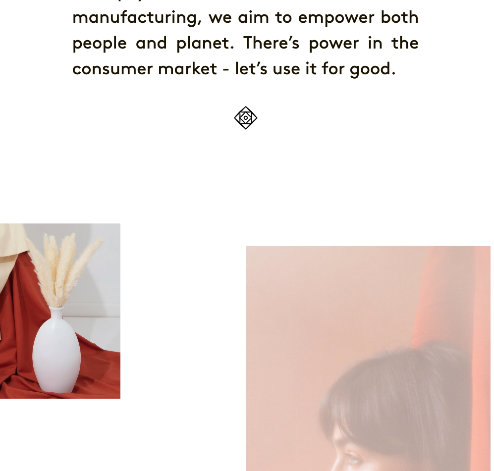
Through understanding our customer, their values and desires, we were able to create an e-commerce experience that spoke directly to them. We did this through over-communicating that we were sustainable, and ethically focused by donating a portion of profits to a 501c3 charity. This focus on speaking directly to our customers showed itself to be beneficial, as we saw not only and increase in conversion rate, but also an increase in time on site.

